
Amazon Prime Redesign l UX/UI & Design research
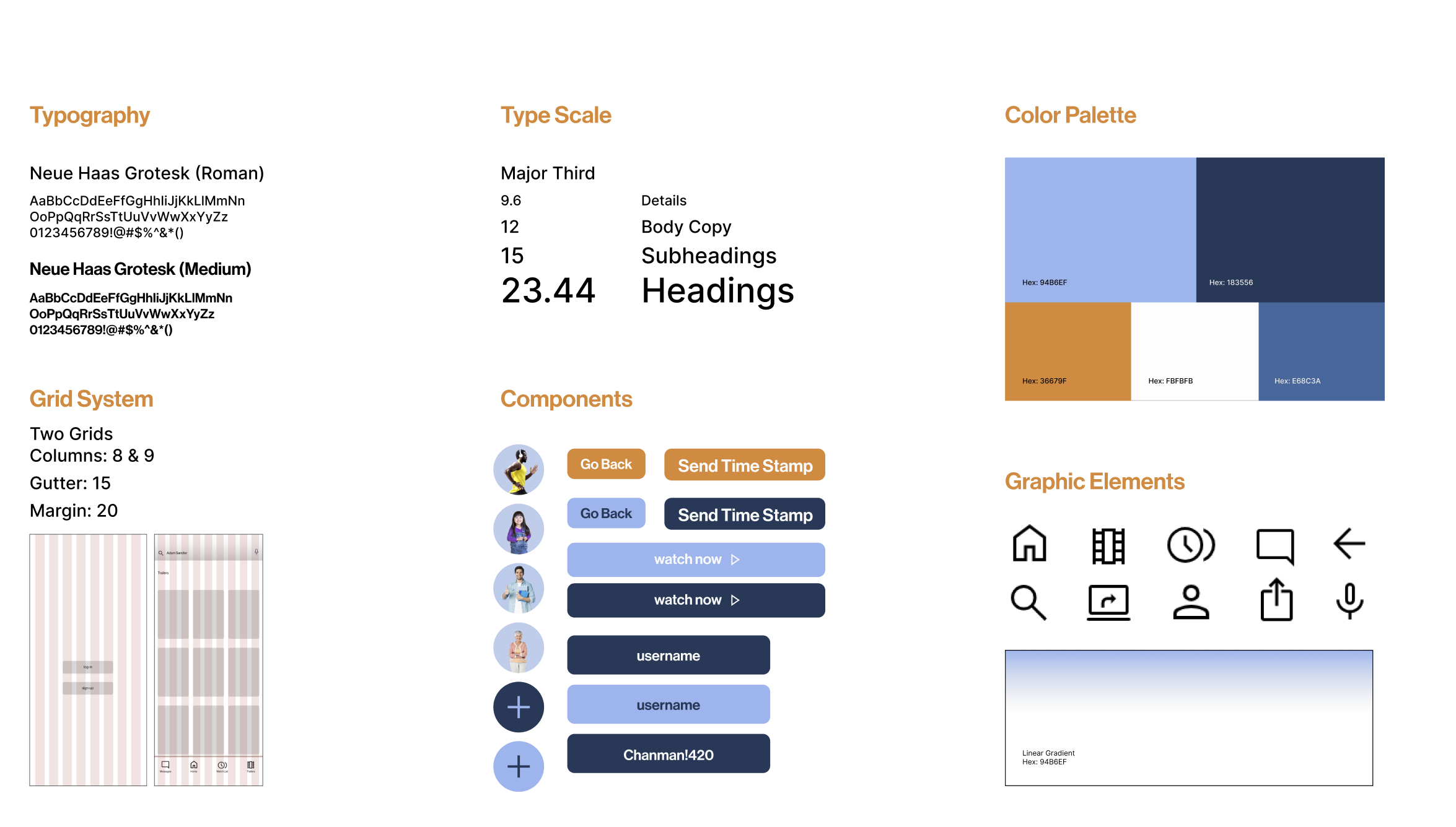
Redesigning the Amazon Prime Video app. This project was to analyze the usability and design system of Amazon Prime. New features include a similar home page, direct messaging, and a trailer preview scroll section. The emphasis is on an effective visual interface and navigation system development through the principles of information hierarchy, visualization, interactivity, and usability.
*Was a collaborative, creative process with other graphic designers: Izzy Thomas, Abra Riley, and Michaela Townsend. Check out the complete process book here!
Skills
UX/UI
Benchmarking
Prototyping
Wire-framing
Figma
Benchmarking
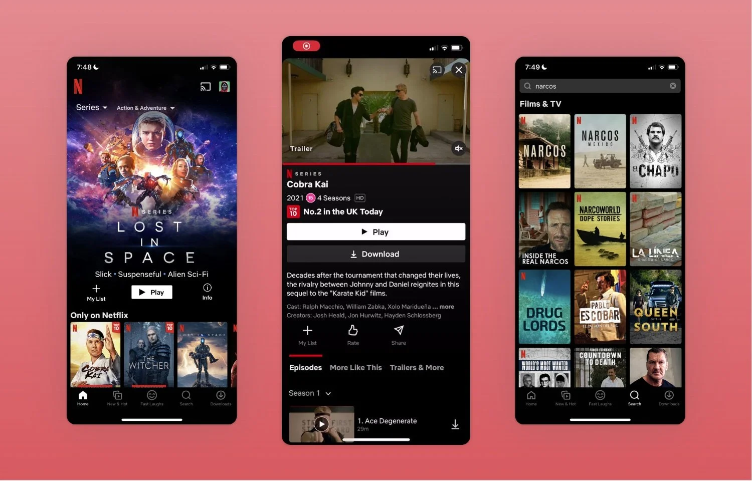
We researched other apps similar to Amazon Prime to pinpoint Pain Points and successful design. We took notes of what we might want to include in our app and what is not necessary, while keeping in mind different ux/ui trends in 2023.
Netflix
Disney+
Youtube
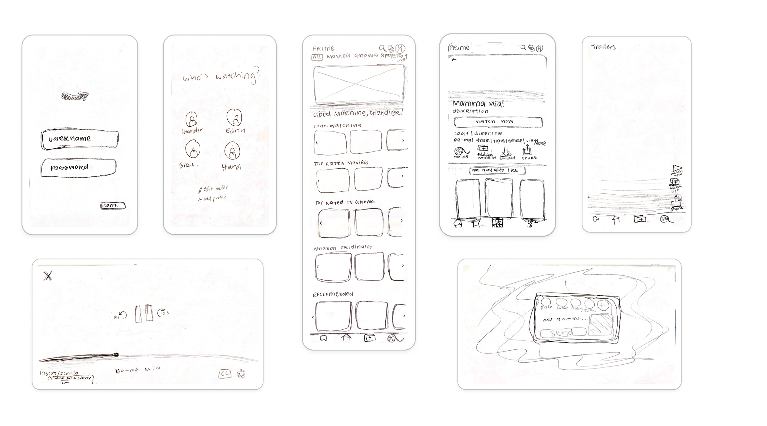
Prototyping and feedback
Feedback:
Struggled to find search bar
Icons are questionable
Keep header and footer for easy exits
Nice personable “Good Morning Chandler” touch
Horizontal titles are successful
Trailer reels are intriguing
Personas
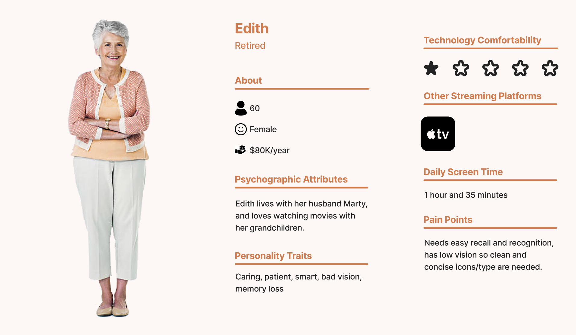
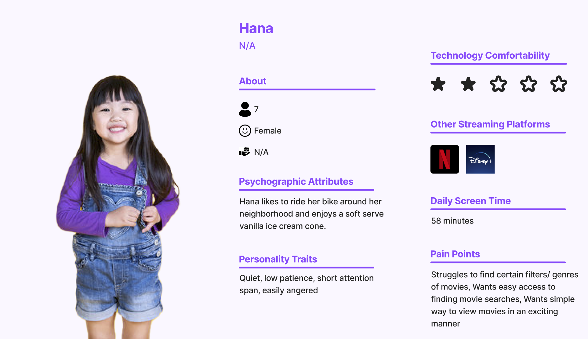
As a team, we each came up with personas that allowed us to see different types of users and help us create a user friendly app for all. We have 4 different profiles that represent small percentages of our users. We highlighted Chandler’s persona for the app.
B&W Wireframes
Visual System

Final Prototype
Scan the QR code to try it for yourself!
