Amazon Prime UI Redesign
UX/UI Redesign

Skills:
UX/UI, Wireframing, Prototyping
Tools:
Figma
Year:
2023 (In collaboration with Abra Riley, Izzy Thomas, and Michaela Townsend)
An app redesign that enhances usability and introduces new, modern features to engage users and prolong use.
This project analyzes the usability and design system of Amazon Prime and implement new features and workflow to enhance the user experience. We explored design trends, usability enhancements, and overall increase user journey flow within the app.
Understanding The Space
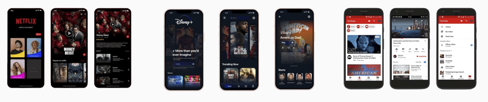
COMPETITIVE ANALYSIS
We dove into other apps in this space to understand what is working and what is not working. We looked at Netflix, DisneyPlus, Youtube, TikTok, and HBO Max.
KEY INSIGHTS

Research
CARD SORTING EXERCISE
This helped us understand how to redesign the information architecture to flow more consistently and something the user better understands. We wrote out all of the actions and categories from the experience and had participants group them where they thought was best. We took note and applied it to the new information architecture design.

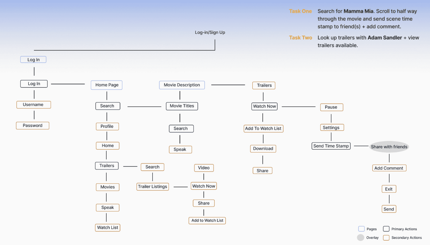
PROPOSED INFORMATION ARCHITECTURE
Based on our card sorting exercise, and overall user feedback, we adjusted the information architecture. The updated one fits more to our users' needs and to incorporate new features and groupings. We changed the homepage to be the primary function and minimal options for the user. The last IA was overwhelming and honestly didn't make much sense.
PROTOTYPING & FEEDBACK
Some of the feedback is that users said there were some problems with hierarchy (text size, some are too small). Alignment needs to be adjusted and flow cleaner. The personalization on the home page is nice and brings more personality to the application. Users like the additional feature of the trailer page. This feedback and information was very helpful in making another iteration and designing for the users.
PERSONAS

BRAND IDENTITY

We chose this brand identity to keep a clean minimalistic feel that are consistent with other competitors. However, we added in a pop of orange as an accent color to provide more personality overall. Our icons are bold so the user can easily access the different pages and features.
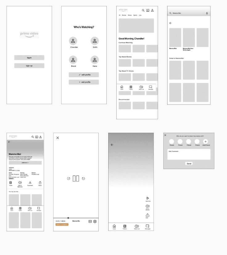
FINAL PROTOTYPE
We chose this brand identity to keep a clean minimalistic feel that are consistent with other competitors. However, we added in a pop of orange as an accent color to provide more personality overall. Our icons are bold so the user can easily access the different pages and features.